1. 实现三角形
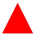
宽高设0,如果朝上,左右border透明,bottom 数值是2倍,设置颜色
<div class="triangle"></div>

<style>
.triangle {
    width: 0;
    height: 0;
    border-left: 25px solid transparent;
    border-right: 25px solid transparent;
    border-bottom: 50px solid red;
    /* bottom 是其他的2倍,说明三角朝上,其他方向原理一样 */
}
</style>
2. 实现空心三角箭头

<div class="arrow"></div>

<style>
.arrow:after {
    content: "";
    display: inline-block;
    width: 6px;
    height: 6px;
    border-top: 1px solid red;
    border-right: 1px solid red;
    transform: rotate(135deg);
    -webkit-transform: rotate(135deg);
}
</style>