.activeBtn {
    &:active {
        animation: animateBtn 0.4s;
    }
}
@keyframes animateBtn {
    0% {
        transform: scale(1);
    }
    50% {
        transform: scale(0.86);
    }
    100% {
        transform: scale(1);
    }
}

animation: upDown 2s infinite;

@keyframes upDown {
    0% {
        transform: translate(0px, 0px);
    }
    50% {
        transform: translate(0px, -30px);
    }
    100% {
        transform: translate(0px, 0px);
    }
}
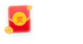
<span class="red-packets"></span>

.red-packets {
    display: inline-block;
    width: 35px;
    height: 40px;
    background: url('https://iknowpc.bdimg.com/static/question-new/widget/ask/replyer/img/wld-exp-btn-hb.f91c70d.png')
        no-repeat;
    background-size: 100% 100%;
    animation-name: upAnimation;
    transform-origin: center bottom;
    animation-duration: 2s;
    animation-fill-mode: both;
    animation-iteration-count: infinite;
    animation-delay: 0.5s;
}
@keyframes upAnimation {
    0% {
        transform: rotate(0deg);
        transition-timing-function: cubic-bezier(
            0.215,
            0.61,
            0.355,
            1
        );
    }
    10% {
        transform: rotate(-12deg);
        transition-timing-function: cubic-bezier(
            0.215,
            0.61,
            0.355,
            1
        );
    }
    20% {
        transform: rotate(12deg);
        transition-timing-function: cubic-bezier(
            0.215,
            0.61,
            0.355,
            1
        );
    }
    28% {
        transform: rotate(-10deg);
        transition-timing-function: cubic-bezier(
            0.215,
            0.61,
            0.355,
            1
        );
    }
    36% {
        transform: rotate(10deg);
        transition-timing-function: cubic-bezier(
            0.755,
            0.5,
            0.855,
            0.06
        );
    }
    42% {
        transform: rotate(-8deg);
        transition-timing-function: cubic-bezier(
            0.755,
            0.5,
            0.855,
            0.06
        );
    }
    48% {
        transform: rotate(8deg);
        transition-timing-function: cubic-bezier(
            0.755,
            0.5,
            0.855,
            0.06
        );
    }
    52% {
        transform: rotate(-4deg);
        transition-timing-function: cubic-bezier(
            0.755,
            0.5,
            0.855,
            0.06
        );
    }
    56% {
        transform: rotate(4deg);
        transition-timing-function: cubic-bezier(
            0.755,
            0.5,
            0.855,
            0.06
        );
    }
    60% {
        transform: rotate(0deg);
        transition-timing-function: cubic-bezier(
            0.755,
            0.5,
            0.855,
            0.06
        );
    }
    100% {
        transform: rotate(0deg);
        transition-timing-function: cubic-bezier(
            0.215,
            0.61,
            0.355,
            1
        );
    }
}
<div class="circle-breath"></div>
.circle-breath {
background: pink;
height: 36px;
width: 36px;
border-radius: 50%;
animation: donghua 2.4s infinite;
}
@keyframes donghua {
0% {
transform: scale(0.60);
box-shadow: 0 0 0 0 rgba(204, 73, 152, 60%);
}
60% {
transform: scale(1);
box-shadow: 0 0 0 36px rgba(204, 73, 152, 0%);
}
100% {
transform: scale(0.60);
box-shadow: 0 0 0 0 rgba(204, 73, 152, 0%);
}
}

<button class="microphone-btn">
    <div class="microphone-icon recording">
        <div class="wave"></div>
        <div class="wave"></div>
        <div class="wave"></div>
    </div>
</button>
.microphone-btn {
border: none;
background-color: transparent;
cursor: pointer;
position: relative;
outline: none;
}
.microphone-icon {
width: 50px;
height: 50px;
background-color: #333;
border-radius: 50%;
position: relative;
display: flex;
justify-content: center;
align-items: center;
transition: background-color 0.3s;
}
.microphone-icon::before {
content: '';
width: 20px;
height: 30px;
background-color: #fff;
border-radius: 10px 10px 0 0;
position: absolute;
top: 5px;
}
.microphone-icon::after {
content: '';
width: 10px;
height: 10px;
background-color: #fff;
border-radius: 50%;
position: absolute;
bottom: 5px;
}
.wave {
position: absolute;
border: 4px solid #f00;
border-radius: 50%;
opacity: 0;
animation: wave-animation 1.5s infinite;
}
.microphone-icon.recording .wave:nth-child(1) {
animation-delay: 0s;
}
.microphone-icon.recording .wave:nth-child(2) {
animation-delay: 0.5s;
}
.microphone-icon.recording .wave:nth-child(3) {
animation-delay: 1s;
}
@keyframes wave-animation {
0% {
width: 50px;
height: 50px;
opacity: 1;
border-color: rgba(255, 0, 0, 1);
}
100% {
width: 150px;
height: 150px;
opacity: 0;
border-color: rgba(255, 0, 0, 0);
}
}